
[출처] https://blog.streamlit.io/crafting-a-dashboard-app-in-python-using-streamlit/
Building a dashboard in Python using Streamlit
Using pandas for data wrangling, Altair/Plotly for data visualization, and Streamlit as your frontend
blog.streamlit.io
"그림이 천 마디 말보다 낫다"라는 문구를 잘 알고 계시겠지만, 데이터 과학의 맥락에서 시각화된 도표는 그에 못지않은 가치를 제공합니다. 단순한 꺾은선형 차트, 히스토그램 분포, 보다 정교한 피벗 차트 등의 형태로 표 형식의 데이터를 다른 시각으로 제공함으로써 이를 실현합니다.
이러한 차트는 유용할 수 있지만, 인쇄물이나 웹에서 볼 수 있는 일반적인 차트는 대부분 정적일 가능성이 높습니다. 대화형 대시보드에서 이러한 정적 변수를 조작할 수 있다면 얼마나 더 매력적일지 상상해 보세요.
이 글에서는 미국 인구조사국에서 얻은 2010~2019년 미국 인구에 대한 데이터와 시각화를 표시하는 인구 대시보드 앱을 만드는 방법을 알아봅니다.
이 대화형 대시보드 앱을 처음부터 스트림릿을 사용해 처음부터 구축하는 과정을 안내해 드리겠습니다. 강력한 데이터 처리 및 분석을 보장하는 NumPy, Pandas, Scikit-Learn, Altair와 같은 패키지들이 백엔드를 담당합니다.
다음의 3가지를 배울 예정입니다:
- key metrics 정의하기
- EDA 분석 수행하기
- Streamlit으로 대시보드 앱 만들기
다음은 이 인구 대시보드를 구성하는 구성 요소를 간단히 정리한 것입니다.

1. 주요 지표(key metrics) 정의하기
실제로 대시보드를 구축하기 전에 먼저 중요한 것을 측정할 수 있는 잘 정의된 메트릭을 만들어야 합니다.
1.1. 주요 지표에 대한 개요
모든 대시보드의 목표는 데이터 기반 의사 결정의 기초가 되는 인사이트를 표시하는 것입니다. 대시보드의 주요 목적은 무엇인가요? 이는 대시보드가 주요 지표의 형태로 답변하기를 원하는 후속 질문에 대한 지침이 됩니다.
예를 들어:
- 영업 부서의 주요 목표는 이해하는 것일 수 있습니다: "영업팀의 실적은 어떻습니까?" 지표에는 영업 담당자별 총 매출, 지역별 판매 단위, 시간 경과에 따라 생성된 신규 리드 등이 포함될 수 있습니다.
- 마케팅에서는 "내 캠페인의 성과는 어떠한가?"를 파악하는 것이 주요 목표일 수 있으며, 여기에는 반응률이나 클릭률과 같은 선행 지표와 매출 전환율 또는 고객 확보 비용과 같은 후행 지표를 측정하는 것이 포함될 수 있습니다.
- 재무에서는 대시보드에 "우리 비즈니스의 수익성은 어느 정도인가요?"라는 질문에 대한 답이 필요할 수 있으며, 여기에는 매출 총이익, 영업이익률, 자산 수익률 등이 포함될 수 있습니다.
1.2. 인구 대시보드를 위해 선택된 주요 지표
이 인구 대시보드가 답하고자 하는 주요 질문은 '미국 주 인구는 시간에 따라 어떻게 변화하는가'입니다.
이 대시보드 목표에 답하는 데 도움이 되는 질문에는 어떤 것이 있을까요?
- 전체 인구를 주마다 어떻게 비교할 수 있는가?
- 시간이 지남에 따라 주 인구는 어떻게 변화하고 서로 어떻게 비교되는가?
- 특정 연도에 50,000명 이상의 전입 또는 전출이 발생한 주는 어디인가?
2. EDA 분석 수행하기
핵심 지표를 확보한 후에는 대시보드에 시각적으로 심미적인 방식으로 표시하기 전에 사용 가능한 데이터를 수집하고 이에 대한 확실한 이해를 얻어야 합니다.
탐색적 데이터 분석(EDA)은 데이터를 분석하는 조사 작업을 통해 질문하고 답하는 데이터 이해를 위한 반복적인 프로세스라고 정의할 수 있습니다. 기본적으로 대시보드는 빈 캔버스로 시작하며, EDA는 스토리를 전달하는 설득력 있는 데이터 시각적 자료를 만들기 위한 실용적인 접근 방식을 제공합니다.
1977년 존 투키의 EDA에 관한 중요한 연구는 효과적인 데이터 통신을 위한 무대를 세심하게 마련했습니다. 다음은 몇 가지 주목할 만한 주요 내용입니다:
- "그래프의 가장 큰 가치는 우리가 예상하지 못했던 것을 보게 할 때입니다." 실제로 투키는 박스 및 위스커 플롯(일명 박스 플롯)을 소개했습니다.
- 데이터에 접근할 때 유연하고 개방적인 사고방식, 즉 EDA의 '탐색적' 특성을 갖추는 것이 중요합니다.
2.1. 어떤 데이터를 사용할 수 있는가?
다음은 인구 대시보드에 사용하는 미국 인구조사국의 데이터 세트 샘플입니다. 메트릭의 기초가 되는 세 가지 잠재적 변수(주, 연도 및 인구)가 있습니다.
states, states_code, id, year, population
Alabama, AL, 1, 2010, 4785437
Alaska, AK, 2, 2010, 713910
Arizona, AZ, 4, 2010, 6407172
Arkansas, AR, 5, 2010, 2921964
California, CA, 6, 2010, 37319502
2.2. 데이터 준비하기
연도 열을 하나의 통합 열로 통합합니다. 데이터를 연도별로 하위 집합화하면 가능한 시각화(예: 히트맵, 색도 맵 등)와 정렬 가능한 데이터 프레임을 생성하는 데 필요한 형식을 제공할 수 있다는 이점이 있습니다.
2.3. 주요 지표를 가장 잘 시각화할 수 있는 차트를 선택하라
이제 손끝으로 데이터를 더 잘 이해하고 측정할 주요 메트릭을 파악했으니 대시보드에서 결과를 시각화할 방법을 결정할 차례입니다. 데이터 집합을 시각화하는 방법은 무수히 많지만, 인구 대시보드 앱에 선택한 방법은 다음과 같습니다.
- 여러 주 간의 총 인구 비교는 어떻게 되나요?
- 코로플리스 맵은 지리적 공간 차원을 추가하여 인구가 가장 많은 주와 가장 적은 주를 강조 표시합니다.
- 시간이 지남에 따라 다른 주의 인구는 어떻게 진화하며 서로 어떻게 비교할 수 있을까요?
- 히트맵은 여러 연도에 걸쳐 이 정보를 표시하여 인구가 가장 많은 주와 가장 적은 주에 대한 포괄적인 개요를 제공합니다.
- 데이터 프레임을 정렬하면 인구가 가장 많은 주와 가장 적은 주를 빠르고 직접적으로 비교할 수 있으므로 차트의 여러 섹션을 돌아다닐 필요가 없습니다.
- 특정 연도에 5만 명 이상의 인바운드/아웃바운드 마이그레이션을 경험하는 전체 주 중 몇 퍼센트나 되나요?
- 도넛 차트는 내부 호가 비어 있는 원형 차트이며, 인바운드 및 아웃바운드 상태 마이그레이션의 비율을 시각화하기 위해 사용하고 있습니다.
데이터 집합을 시각화하는 방법은 무수히 많습니다! 커뮤니티에서 점점 더 많은 사용자 지정 구성 요소 모음에서 더 많은 시각화 옵션을 발견할 수 있습니다. 다음은 몇 가지 시도해 볼 수 있는 옵션입니다:
- streamlit-extras 는 스트림릿의 기본 기능을 확장하는 다양한 위젯을 제공합니다.
- streamlit-shadcn-ui 는 대시보드 앱에 통합할 수 있는 여러 UI 프런트엔드 구성 요소(모달, 호버카드, 배지 등)를 제공합니다.
- streamlit-elements 를 사용하면 드래그 및 크기 조정이 가능한 대시보드 구성 요소를 만들 수 있습니다.
3. Streamlit으로 대시보드 구축하기
3.1. 라이브러리 불러오기
먼저 필수 라이브러리를 가져오는 것부터 시작하겠습니다:
- Streamlit - a low-code web framework
- Pandas - a data analysis and wrangling tool
- Altair - a data visualization library
- Plotly Express - a terse and high-level API for creating figures
import streamlit as st
import pandas as pd
import altair as alt
import plotly.express as px
3.2. 페이지 configuration
다음으로 브라우저에 표시되는 페이지 제목과 아이콘을 지정하여 앱의 설정을 정의합니다. 또한 페이지 너비에 맞는 와이드 레이아웃으로 표시할 페이지 콘텐츠를 정의하고 사이드바를 확장된 상태로 표시합니다.
여기에서는 앱의 어두운 색상 테마와 어울리도록 Altair 플롯의 색상 테마도 어둡게 설정했습니다.
st.set_page_config(
    page_title="US Population Dashboard",
    page_icon="🏂",
    layout="wide",
    initial_sidebar_state="expanded")

alt.themes.enable("dark")
3.3. 데이터 업로드
다음으로 다음과 같이 Pandas의 read_csv() 함수를 사용하여 앱에 데이터를 로드합니다:
df_reshaped = pd.read_csv('data/us-population-2010-2019-reshaped.csv')3.4. 사이드바 추가하기
이제 st.title()을 통해 앱 제목을 만들고, st.selectbox()를 통해 사용자가 특정 연도와 색상 테마를 선택할 수 있는 드롭다운 위젯을 만들겠습니다.
그런 다음 선택한 연도(2010~2019년 중 사용 가능한 연도)를 사용하여 해당 연도의 데이터를 하위 집합한 다음 앱에 표시합니다.
선택한 색상 테마를 사용하면 앞서 언급한 위젯에서 선택한 색상에 따라 채도 맵과 히트맵에 색상을 지정할 수 있습니다.
with st.sidebar:
    st.title('🏂 US Population Dashboard')

    year_list = list(df_reshaped.year.unique())[::-1]

    selected_year = st.selectbox('Select a year', year_list, index=len(year_list)-1)
    df_selected_year = df_reshaped[df_reshaped.year == selected_year]
    df_selected_year_sorted = df_selected_year.sort_values(by="population", ascending=False)

    color_theme_list = ['blues', 'cividis', 'greens', 'inferno', 'magma', 'plasma', 'reds', 'rainbow', 'turbo', 'viridis']
selected_color_theme = st.selectbox('Select a color theme', color_theme_list)- st.selectbox의 1~3번째 파라미터는 아래와 같다.
st.selectbox(label, options, index=0) - label은 select box 위에 표시될 설명
- options는 select box의 선택지
- index는 디폴트로 표시할 선택지의 상대위치
- 각 파라미터에 대한 설명은 공식문서 참고
3.5.플롯 및 차트 유형
다음으로 대시보드에 표시되는 다양한 플롯을 만들기 위한 사용자 지정 함수를 정의하겠습니다.
Heatmap
히트맵을 통해 2010년부터 2019년까지 52개 주의 인구 증가율을 확인할 수 있습니다.
def make_heatmap(input_df, input_y, input_x, input_color, input_color_theme):
    heatmap = alt.Chart(input_df).mark_rect().encode(
            y=alt.Y(f'{input_y}:O', axis=alt.Axis(title="Year", titleFontSize=18, titlePadding=15, titleFontWeight=900, labelAngle=0)),
            x=alt.X(f'{input_x}:O', axis=alt.Axis(title="", titleFontSize=18, titlePadding=15, titleFontWeight=900)),
            color=alt.Color(f'max({input_color}):Q',
                             legend=None,
                             scale=alt.Scale(scheme=input_color_theme)),
            stroke=alt.value('black'),
            strokeWidth=alt.value(0.25),
        ).properties(width=900
        ).configure_axis(
        labelFontSize=12,
        titleFontSize=12
        )
    # height=300
    return heatmap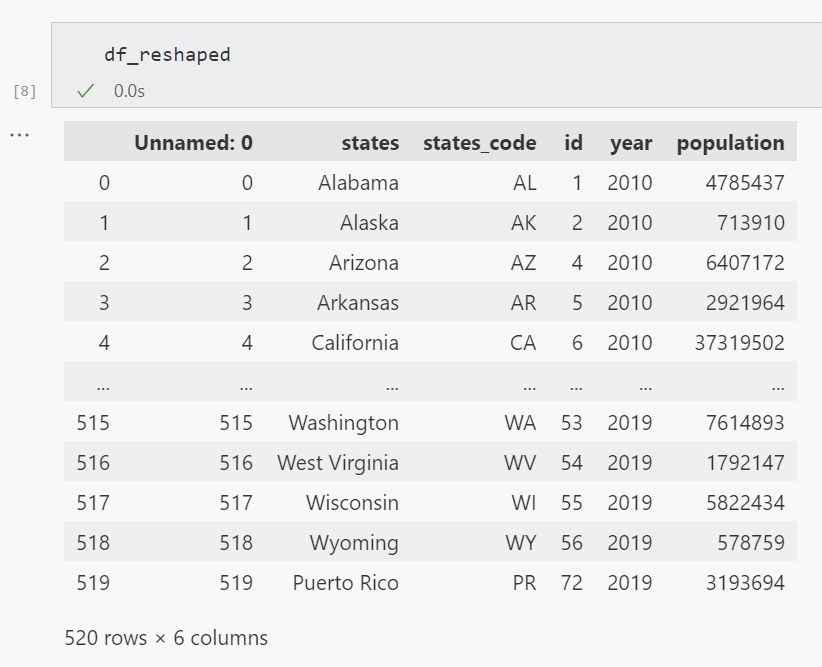
Choropleth map
다음으로, 선택한 연도의 미국 52개 주를 컬러로 표시한 지도가 코로플리스 맵으로 표시됩니다.
def make_choropleth(input_df, input_id, input_column, input_color_theme):
    choropleth = px.choropleth(input_df, locations=input_id, color=input_column, locationmode="USA-states",
                               color_continuous_scale=input_color_theme,
                               range_color=(0, max(df_selected_year.population)),
                               scope="usa",
                               labels={'population':'Population'}
                              )
    choropleth.update_layout(
        template='plotly_dark',
        plot_bgcolor='rgba(0, 0, 0, 0)',
        paper_bgcolor='rgba(0, 0, 0, 0)',
        margin=dict(l=0, r=0, t=0, b=0),
        height=350
    )
    return choropleth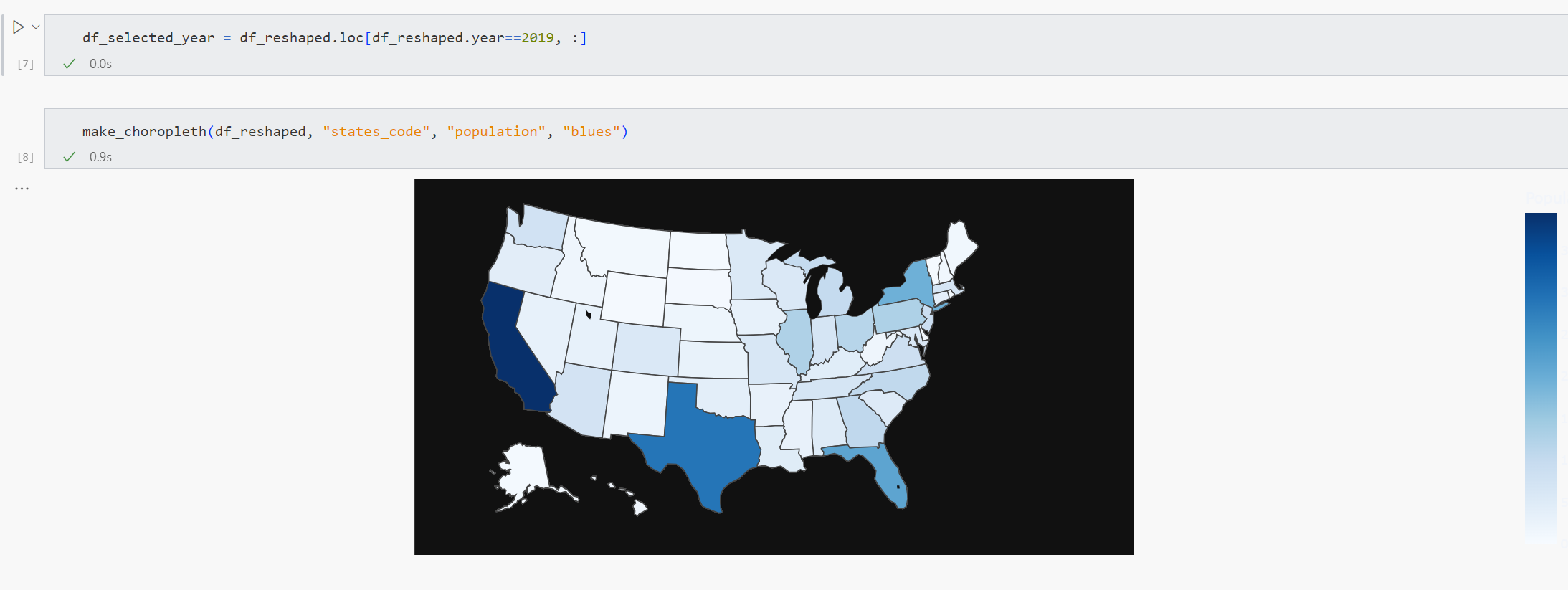
Donut chart
다음으로, 주 마이그레이션을 백분율로 표시하는 도넛 차트를 만들겠습니다.
특히, 이는 연간 인바운드 또는 아웃바운드 마이그레이션이 5만 명을 초과하는 주의 비율을 나타냅니다. 예를 들어, 2019년에는 52개 주 중 12개 주에서 23%에 해당합니다.
도넛 차트를 만들기 전에 전년 대비 인구 이동을 계산해야 합니다.
def calculate_population_difference(input_df, input_year):
  selected_year_data = input_df[input_df['year'] == input_year].reset_index()
  previous_year_data = input_df[input_df['year'] == input_year - 1].reset_index()
  selected_year_data['population_difference'] = selected_year_data.population.sub(previous_year_data.population, fill_value=0)
  return pd.concat([selected_year_data.states, selected_year_data.id, selected_year_data.population, selected_year_data.population_difference], axis=1).sort_values(by="population_difference", ascending=False)
그런 다음 앞서 언급한 상태 마이그레이션에 대한 백분율 값으로 도넛 차트를 만듭니다.
def make_donut(input_response, input_text, input_color):
  if input_color == 'blue':
      chart_color = ['#29b5e8', '#155F7A']
  if input_color == 'green':
      chart_color = ['#27AE60', '#12783D']
  if input_color == 'orange':
      chart_color = ['#F39C12', '#875A12']
  if input_color == 'red':
      chart_color = ['#E74C3C', '#781F16']

  source = pd.DataFrame({
      "Topic": ['', input_text],
      "% value": [100-input_response, input_response]
  })
  source_bg = pd.DataFrame({
      "Topic": ['', input_text],
      "% value": [100, 0]
  })

  plot = alt.Chart(source).mark_arc(innerRadius=45, cornerRadius=25).encode(
      theta="% value",
      color= alt.Color("Topic:N",
                      scale=alt.Scale(
                          #domain=['A', 'B'],
                          domain=[input_text, ''],
                          # range=['#29b5e8', '#155F7A']),  # 31333F
                          range=chart_color),
                      legend=None),
  ).properties(width=130, height=130)

  text = plot.mark_text(align='center', color="#29b5e8", font="Lato", fontSize=32, fontWeight=700, fontStyle="italic").encode(text=alt.value(f'{input_response} %'))
  plot_bg = alt.Chart(source_bg).mark_arc(innerRadius=45, cornerRadius=20).encode(
      theta="% value",
      color= alt.Color("Topic:N",
                      scale=alt.Scale(
                          # domain=['A', 'B'],
                          domain=[input_text, ''],
                          range=chart_color),  # 31333F
                      legend=None),
  ).properties(width=130, height=130)
  return plot_bg + plot + text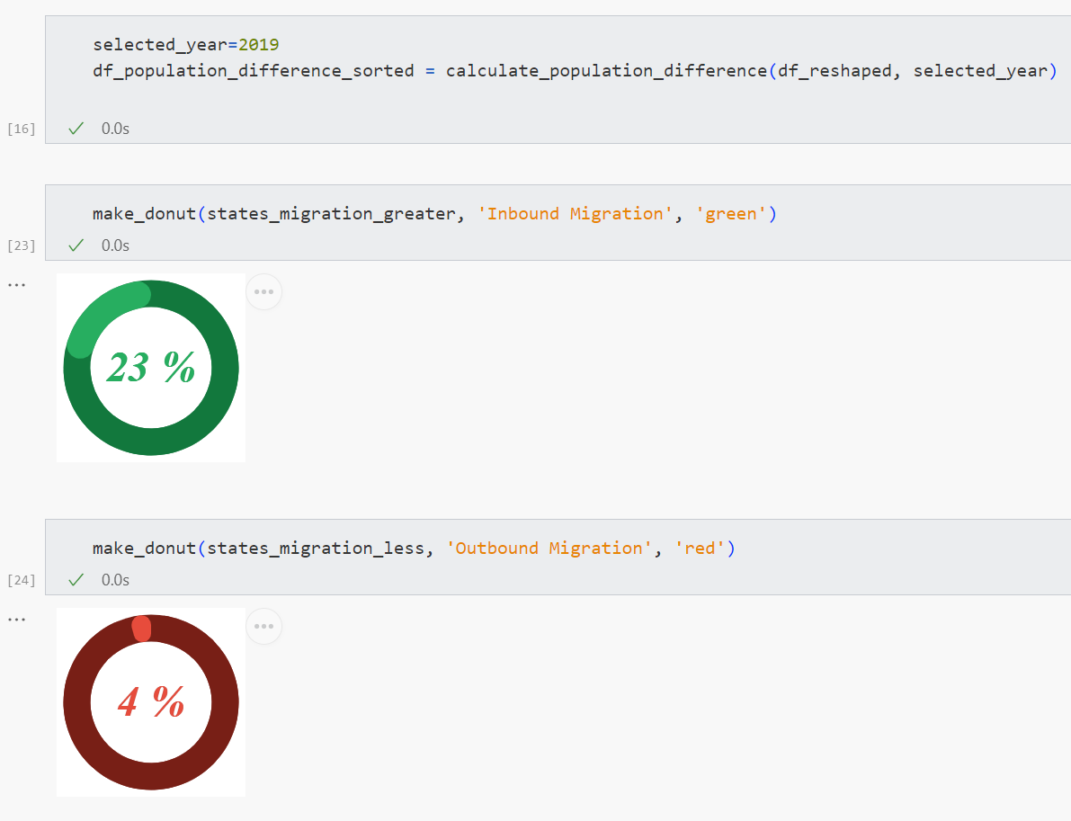
Convert population to text
다음으로 인구수 값을 보다 간결하게 표시하고 미관을 개선하기 위한 사용자 정의 함수를 만들어 보겠습니다. 특히, 지표 카드에서 28,995,881이라는 수치로 표시되던 것을 29.0M이라는 보다 간결한 형태로 바꾸고, 천 단위의 수치에도 이 함수를 적용했습니다.
def format_number(num):
    if num > 1000000:
        if not num % 1000000:
            return f'{num // 1000000} M'
        return f'{round(num / 1000000, 1)} M'
    return f'{num // 1000} K'
3.6. 앱 레이아웃
마지막으로 앱에서 모든 것을 정리할 차례입니다.
Define the layout
먼저 3개의 열을 만듭니다:
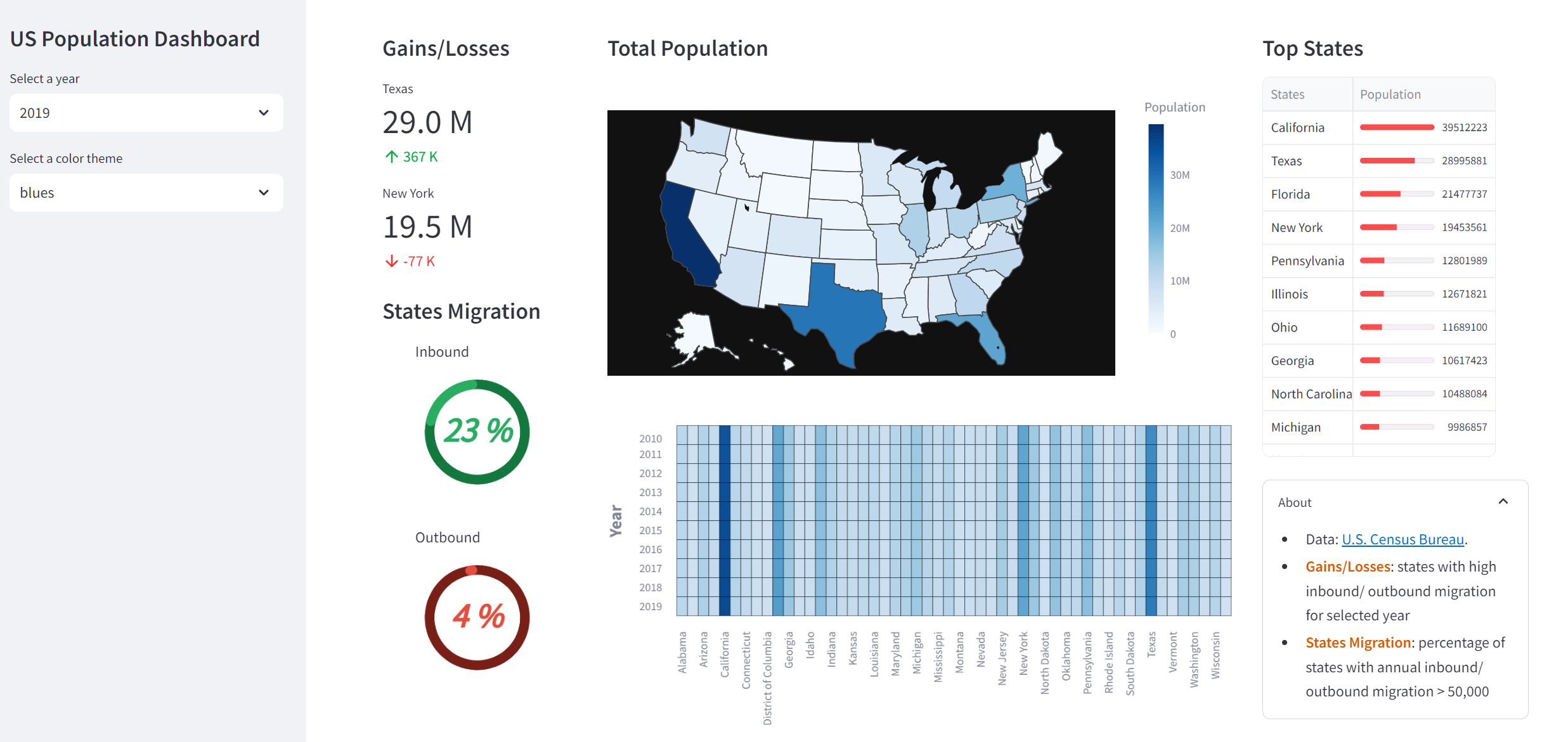
col = st.columns((1.5, 4.5, 2), gap='medium')특히 입력 인수(1.5, 4.5, 2)는 두 번째 열의 폭이 첫 번째 열의 약 3배, 세 번째 열의 폭이 두 번째 열보다 약 2배 작다는 것을 나타냅니다.
Column 1
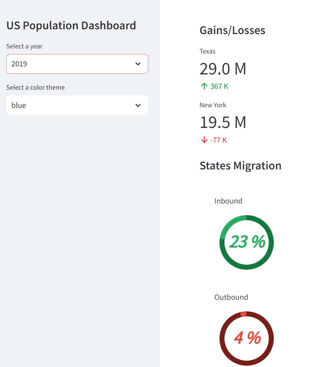
이득/손실 섹션에는 선택한 연도에 가장 많은 인바운드 및 아웃바운드 마이그레이션이 발생한 주를 표시하는 지표 카드가 표시됩니다(st.selectbox를 통해 생성된 연도 선택 드롭다운 위젯을 통해 지정됨).
주 마이그레이션 섹션에는 연간 인바운드 또는 아웃바운드 마이그레이션이 50,000을 초과하는 주의 비율이 표시된 도넛형 차트가 표시됩니다.
with col[0]:
    st.markdown('#### Gains/Losses')

    df_population_difference_sorted = calculate_population_difference(df_reshaped, selected_year)

    if selected_year > 2010:
        first_state_name = df_population_difference_sorted.states.iloc[0]
        first_state_population = format_number(df_population_difference_sorted.population.iloc[0])
        first_state_delta = format_number(df_population_difference_sorted.population_difference.iloc[0])
    else:
        first_state_name = '-'
        first_state_population = '-'
        first_state_delta = ''
    st.metric(label=first_state_name, value=first_state_population, delta=first_state_delta)

    if selected_year > 2010:
        last_state_name = df_population_difference_sorted.states.iloc[-1]
        last_state_population = format_number(df_population_difference_sorted.population.iloc[-1])
        last_state_delta = format_number(df_population_difference_sorted.population_difference.iloc[-1])
    else:
        last_state_name = '-'
        last_state_population = '-'
        last_state_delta = ''
    st.metric(label=last_state_name, value=last_state_population, delta=last_state_delta)


    st.markdown('#### States Migration')

    if selected_year > 2010:
        # Filter states with population difference > 50000
        # df_greater_50000 = df_population_difference_sorted[df_population_difference_sorted.population_difference_absolute > 50000]
        df_greater_50000 = df_population_difference_sorted[df_population_difference_sorted.population_difference > 50000]
        df_less_50000 = df_population_difference_sorted[df_population_difference_sorted.population_difference < -50000]

        # % of States with population difference > 50000
        states_migration_greater = round((len(df_greater_50000)/df_population_difference_sorted.states.nunique())*100)
        states_migration_less = round((len(df_less_50000)/df_population_difference_sorted.states.nunique())*100)
        donut_chart_greater = make_donut(states_migration_greater, 'Inbound Migration', 'green')
        donut_chart_less = make_donut(states_migration_less, 'Outbound Migration', 'red')
    else:
        states_migration_greater = 0
        states_migration_less = 0
        donut_chart_greater = make_donut(states_migration_greater, 'Inbound Migration', 'green')
        donut_chart_less = make_donut(states_migration_less, 'Outbound Migration', 'red')

    migrations_col = st.columns((0.2, 1, 0.2))
    with migrations_col[1]:
        st.write('Inbound')
        st.altair_chart(donut_chart_greater)
        st.write('Outbound')
        st.altair_chart(donut_chart_less)
Column 2

Next, the second column displays the choropleth map and heatmap using custom functions created earlier.

with col[1]:
    st.markdown('#### Total Population')

    choropleth = make_choropleth(df_selected_year, 'states_code', 'population', selected_color_theme)
    st.plotly_chart(choropleth, use_container_width=True)

    heatmap = make_heatmap(df_reshaped, 'year', 'states', 'population', selected_color_theme)
    st.altair_chart(heatmap, use_container_width=True)
Column 3

Finally, the third column shows the top states via a dataframe whereby the population are shown as a colored progress bar via the column_config parameter of st.dataframe.

An About section is displayed via the st.expander() container to provide information on the data source and definitions for terminologies used in the dashboard.

with col[2]:
    st.markdown('#### Top States')

    st.dataframe(df_selected_year_sorted,
                 column_order=("states", "population"),
                 hide_index=True,
                 width=None,
                 column_config={
                    "states": st.column_config.TextColumn(
                        "States",
                    ),
                    "population": st.column_config.ProgressColumn(
                        "Population",
                        format="%f",
                        min_value=0,
                        max_value=max(df_selected_year_sorted.population),
                     )}
                 )

    with st.expander('About', expanded=True):
        st.write('''
            - Data: [U.S. Census Bureau](<https://www.census.gov/data/datasets/time-series/demo/popest/2010s-state-total.html>).
            - :orange[**Gains/Losses**]: states with high inbound/ outbound migration for selected year
            - :orange[**States Migration**]: percentage of states with annual inbound/ outbound migration > 50,000
            ''')
Column 2
다음으로 두 번째 열은 앞서 만든 사용자 지정 함수를 사용하여 choropleth map 과 히트맵을 표시합니다.
with col[1]:
    st.markdown('#### Total Population')

    choropleth = make_choropleth(df_selected_year, 'states_code', 'population', selected_color_theme)
    st.plotly_chart(choropleth, use_container_width=True)

    heatmap = make_heatmap(df_reshaped, 'year', 'states', 'population', selected_color_theme)
    st.altair_chart(heatmap, use_container_width=True)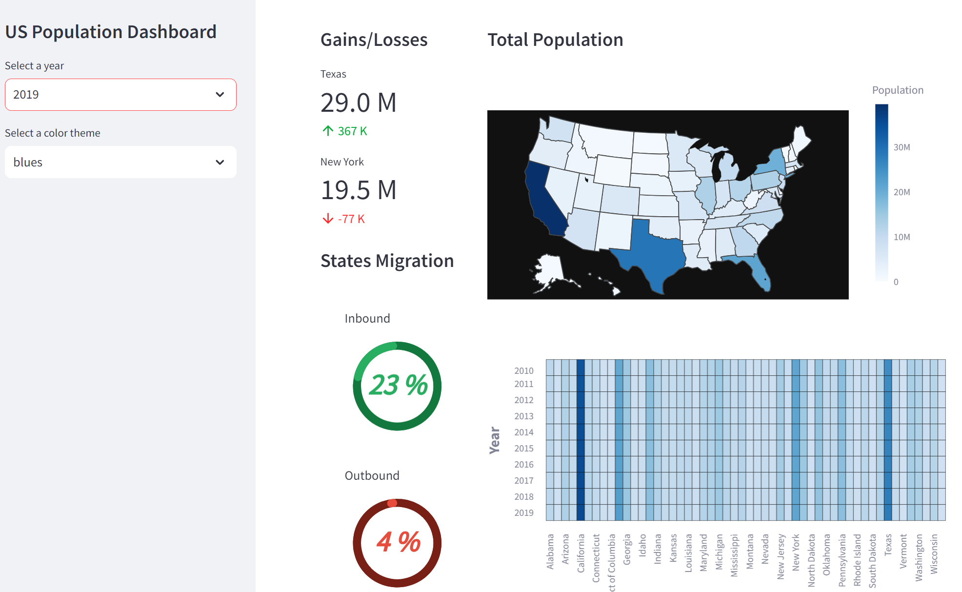
Column 3
마지막으로 세 번째 열은 데이터 프레임을 통해 상위 상태를 표시하며, st.dataframe의 column_config 매개 변수를 통해 인구가 컬러 진행률 표시줄로 표시됩니다.
대시보드에 사용된 용어에 대한 정의와 데이터 원본에 대한 정보를 제공하는 정보 섹션이 st.expander() 컨테이너를 통해 표시됩니다.
with col[2]:
    st.markdown('#### Top States')

    st.dataframe(df_selected_year_sorted,
                 column_order=("states", "population"),
                 hide_index=True,
                 width=None,
                 column_config={
                    "states": st.column_config.TextColumn(
                        "States",
                    ),
                    "population": st.column_config.ProgressColumn(
                        "Population",
                        format="%f",
                        min_value=0,
                        max_value=max(df_selected_year_sorted.population),
                     )}
                 )

    with st.expander('About', expanded=True):
        st.write('''
            - Data: [U.S. Census Bureau](<https://www.census.gov/data/datasets/time-series/demo/popest/2010s-state-total.html>).
            - :orange[**Gains/Losses**]: states with high inbound/ outbound migration for selected year
            - :orange[**States Migration**]: percentage of states with annual inbound/ outbound migration > 50,000
            ''')